By: Holly Czuba
Google announced last week that mobile-friendliness will be ranking signal. In our industry the term mobile is thrown around a lot. But not everyone understands why having a mobile website is critical, or what exactly, a mobile, or mobile-friendly website is. I’ll explain what the various terms mean, and what makes the most user-friendly mobile experience.
Having a Mobile Website is Critical!
Consumer behavior is changing. People use their smartphones and tablets to do everything now! 60% of all website traffic is on a smartphone or tablet!
If your website is hard to use on a mobile device, you are losing potential customers. Mobile users are further down the buying funnel. They are looking for a solution right now. If your site isn’t satisfying their need quickly, they’re moving on.
With that said, here’s a breakdown of mobile and how you can make sure you’re ready for the upcoming search change.
Usable, Mobile-Friendly, Responsive
What Does It Mean and Which One’s Right for Me?
Usability or Usable: In regards to technology and the internet, usability is a quality attribute that defines the ease-of-use of your product (website, application, software). In regards to a mobile website, it references an ability to find the information we need, navigate the site and perform the actions we want, easily.
Mobile-Friendly: A term used to describe a positive mobile experience. This term does not provide much detail on the process by which your website achieved mobile-friendliness, but it is the distinction Google uses for a website that provides a good user experience. Often this is shortened to ‘mobile‘. Is your website mobile? Our website is mobile…
How Can I Get a Mobile Website for My Business?
Responsive (Responsive Website Design, RWD): Responsive website design describes a programming and design process by which elements and layouts on your website shift in size and position to create a good user experience regardless of the screen size.
The most important features of the responsive websites we build are the click to call and click to directions buttons. Front and center, giving the user what they need with one click – these buttons make sure our clients’ customers can get in touch quickly and easily without the hassle of searching for contact information. Here’s a visual demonstration of how a responsive website design shifts based on screen size.
Mobile Site: Your website doesn’t HAVE to be designed using responsive design in order to be mobile-friendly. There are software applications that can build a mobile version of your website and work just as well as a responsive website, sometimes better – depending on how your responsive design handles the contact information!
We have an application that allows us to build mobile websites for clients who get SEO services from us, but keep their own websites. We build their mobile website and insert code snippet into their site. The code snippet redirects users on mobile devices to the mobile version of our client’s site.
What makes a mobile experience great?
We’ve all experienced a horrible mobile website. We can’t find the information we want, we can’t click on the link we need, the site just doesn’t work right.

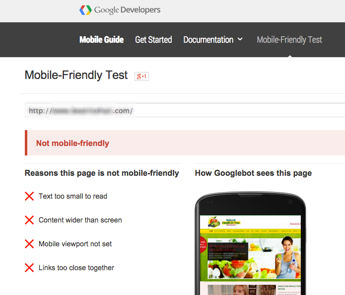
This is a report I ran on a friends website using Google’s Mobile-Friendly Test. As you can see this site is listed as NOT mobile-friendly. As you read through this list you will recognize frustrations you’ve had on mobile sites yourself!
Your website is NOT mobile-friendly if:
- The text is small and hard to read
- Content doesn’t fit on the screen
- The mobile viewport isn’t set
- The links are so close together they are hard to click
- The user can’t find the contact information quickly (ok, this is my own addition…)
In order to give your mobile users a GOOD USER EXPERIENCE, your website must:
- Use text large enough to read. For me 13 px is bordering on too small. I know some designers will cringe at that, but squinting to read a site on my phone isn’t awesome.
- Make sure your content fits on the screen being used. Scrolling vertically is fine! Just make sure I can get to all the content on the page!
- Set the mobile viewport. I’m far from a programmer, but Google has some details here. For the nerds: This is a meta tag that can be set in the head of your document to give your browser instruction on how to control your page’s scaling.
- Make sure your links are click-able. They shouldn’t be too close together. Making sure your text size is large enough should take care of some of this issue.
- Make sure your phone number is clickable! Have a click to call button that is easy to find and use.
- Make sure you have a click to map button! Click to call and click to map are the most desired actions on a mobile phone when looking for a business.
If your web designer hasn’t built a site that provides an adequate mobile experience for your users, give us a call.
You might also like:
More Traffic. More Leads. More Customers.
We help you find your ideal customers, drive traffic to your website and keep business running smoothly. Fill out the form below to start a conversation with one of our digital marketing pros.

